
 By The Numbers Student Handout
Comparing High Schools 2: By the Numbers
Submitted By:

Students examine current data on Philadelphia high schools and use line plots and box plots to explore variation in attendance and other factors and compare neighborhood, citywide admissions, special admissions, and charter schools. This lesson is a follow up to Comparing High Schools 1: Attendance Rates, where students explore these data using measures of center.
- Sticky notes in four colors. (Reuse labeled notes from Comparing High Schools 1: Attendance Rates)
- The data attached here are for 2016 in Philadelphia. If you are in a different location or it is a different year, locate appropriate data for your district.
Hand out the Philadelphia High School Data.
If you have done the Comparing High School Attendance Rates lesson, review with students what they learned about high school attendance and what questions they still have.
- What did you learn about high school attendance in Philadelphia?
- What did the measures of center (mean, median, and mode) tell us?
- What other questions could we explore from this data?
Give students time to make sense of the data on the handout. Point out and clarify the additional data that is in this publication: percentage of low-income students, special education and ELL students, percent of students wtih suspensions, average SAT score.
Explain to students that they will be using some different formats to represent the attendance data from each of the four high school types as an example, and then explore the categories that they are most interested in. Alternatively, you can use a new data set as an example.
Dot Plot
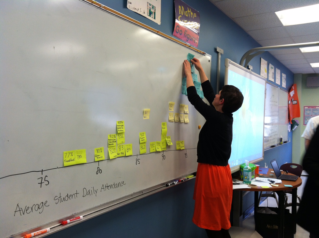
Have students create or recreate the dot plot with the chosen data using a number line and colored sticky notes for each of the four types of schools. (See Comparing High Schools 1: Attendance Rates for more on this). Have students use this class display to sketch the dot plot themselves on the By The Numbers Student Handout.
See the sample below which was created from 2015 data.
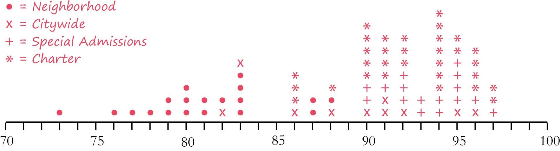
Use this data to introduce the need for measures of variability and graphic representations. Ask:
- The mean and median for daily attendance are higher for the citywide than special admissions schools. Is the daily attendance rate for every special admissions school higher than the attendance rate for every citywide school? Can you find an example?
- What are the drawbacks to using one number to represent a whole data set?
- What do you notice about the citywide attendance data when it’s shown on the dot plot?
- What information does a dot plot show you that the mean or median does not?
The Five Number Summary
Explain that another format for graphing data is a box plot, which uses the five number summary.
- As a class, use the number line on the board to locate the minimum, maximum, and median
- To illustrate how to find the median, have two students come up to the board and start at the two ends, then walk toward each other one number at a time to find the median. Review that when the number of values is even, the median is half-way between them.
- Have two more students come to the board to identify the lower quartile and upper quartile by using the same approach on the upper and lower halves of the dot plot. Discuss percentiles and reinforce that 25% of the data is below the lower quartile while 75% is above, just as 50% is below the median, and 75% is below the upper quartile.
Note: There are at least six different methods that statisticians use to calculate quartiles. Some leave in the median and some remove it. Some pretend that there are two more values on the outsides of the dataset. For middle school purposes, the most common approach is to remove the median if the number of values is odd, and leave all of the values in if the number of values is even. Then, find the median of each half of the data using the same approach as finding the median. Note that this method will not match the results from Excel, graphing calculators, or statistics software.
Box Plots
- With the class, construct a box plot on the board using the same number line as the dot plot. Demonstrate drawing lines for the five number summary, then correctly formatting the box and whiskers. Have students draw their own box plots on the By The Numbers Student Handout.
- Introduce the range as the distance between the minimum and maximum, and the interquartile range (IRQ) as the distance between the upper and lower quartiles. Both of these can be found by subtraction or by counting on from the smaller value to the larger one.
- Discuss how the box plot shows that the middle 50% of the data can be found inside the box, which means that50% of the schools in that category have attendance rates in that range (the interquartile range) while 25% of the data can be found at each end.
- Ask, what does this help us understand about attendance rates in Philadelphia high schools? Different types of schools?

Discuss with students briefly what it would mean if a data set had a large or small range, or a large or small IRQ.
Have students work in small groups to construct dot plots and box plots for attendance rates at each of the four types of high schools (special admission, citywide admission, neighborhood and charter). Then, have students calculate the range and IRQ for each one.
Once they have completed the plots, students should make mathematical observations about the school types using their box plots. Encourage students to write at least 2 or 3 observations so they can share during the discussion time.
Depending on time, have students choose another category of their choice (e.g., percentage of low-income students, average SAT reading score) and compare all four schools on a dot plot and box plot, then find the ranges and IRQs and make observations about the category they chose using the box plots.
Lead a discussion about trends that students found from the data (both attendance and any other categories they explored) and possible reasons why they might occur.
For example,
- The data is much more variable or spread out for neighborhood schools. Why?
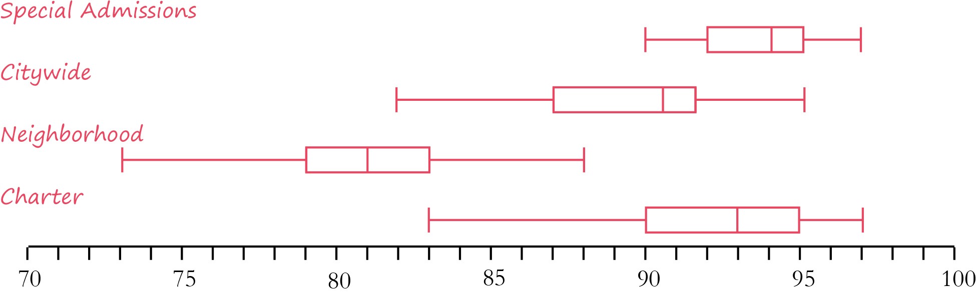
Project a set of box plots (see samples above) and ask, how does this help us compare attendance at the different types of schools? Note how the box plot creates a simplified representation or picture of the whole data set, While the dot plots show every data point, the box plot provides a summary using the five number summary. When would this be useful (e.g., when the data set is very large or the sample sizes are different).
Discuss the different information that is available when using a measure of central tendency (mean or median) versus combining it with some of the measures of variation (range, IRQ, minimum and maximum, etc.) . Students should recognize that measures of variation make the information much more descriptive, and that dot plots and box plots provide more information about the whole data set.
Looking at the differences between types of schools will likely bring up issues of fairness and social justice. What are the differences between schools that have admission requirements and those that don't? What kind of high school would you like to attend?
- Ask students which types of high schools they’d like to attend and have them describe their reasons. Then, ask them what they will need to do to apply. Review that for citywide and special admissions schools, students will need to provide records showing good grades and good behavior and attendance. For special admissions, they will also need high PSSA scores, and sometimes a writing sample, teacher recommendations, and/or a portfolio.
- Have students read more about Philadelphia High Schools at: http://thenotebook.org/articles/2016/09/15/q-a-about-applying-to-high-schools3. You can also have students look at the map to locate nearby schools ( A new edition comes out each fall.) http://thenotebook.org/high-schools.
- To find data on charter schools, see Charter school profiles
- Have students do additional research on the high school admissions process.
- Invite a high school admissions counselor to speak with the class.


Comments
(no comments)