
 Comparing HS Attendance Student Handout
Comparing High Schools 1: Attendance Rates
Submitted By:

Students examine attendance data on Philadelphia high schools, represent it on a line plot, and use the mean, median, and mode to explore how attendance and other categories of data vary between neighborhood, citywide admissions, special admissions, and charter schools. Students use a visual model which presents the mean as a center of balance (like a fulcrum on a see-saw) to understand the important differences between mean and median and when to use them.
This lesson can be followed by Comparing High Schools 2: By the Numbers.
- Sticky notes in four colors and markers.
- Chart paper to save questions and ideas for Comparing High Schools 2: By the Numbers.
- Philadelphia High School Data (If you are in a different location or it is a different year, locate appropriate data for your district.)
Discuss with students what they know about high schools in the area, how high schools are chosen, and questions that they have. Record ideas and questions on chart paper so that they can be saved for lesson 2. The goal of this introduction is to elicit students’ expertise and generate curiosity, not answer questions. Support students in answering each other’s questions if they can, or record questions on the chart paper to answer later.
Have students share what they know about the four types of Philadelphia high schools (see Comparing HS Attendance Possible Solutions).
Distribute and have students explore the Philadelphia High School Data. (Note: An updated report is posted each year.)
Explain to students that the school district records information about each school like number of suspensions, test scores, daily attendance, and so on. Ask: Why does the district collect this information? How could using this information help you to pick a high school?
Invite students to share observations and question. Give students some time to make sense of the data table, share experiences and questions before moving on. Students may be excited to see schools they know and this will help build interest and investment in the lesson.
Explain to students that they’ll be exploring several of the columns, and to start off they will look at attendance rates as a whole group.
- Discuss how attendance rates are calculated. (Attendance rates are determined by the average daily attendance as a percent.)
- Ask for observations about attendance rates at the different types of high schools. Students will likely notice that attendance rates seem higher at special admission schools than at neighborhood schools.
- Ask if the trends are true for all schools in each category. Point to the schools that don't fit the pattern in each category.
- Ask students to brainstorm ways that they can compare the attendance rates between school types. This question should provide an informal assessment of students’ background in measures of central tendency and distribution. Students may mention mean, median, mode, line plots, box plots, scatter plots, bar graphs, stem-and-leaf plots, or other options.
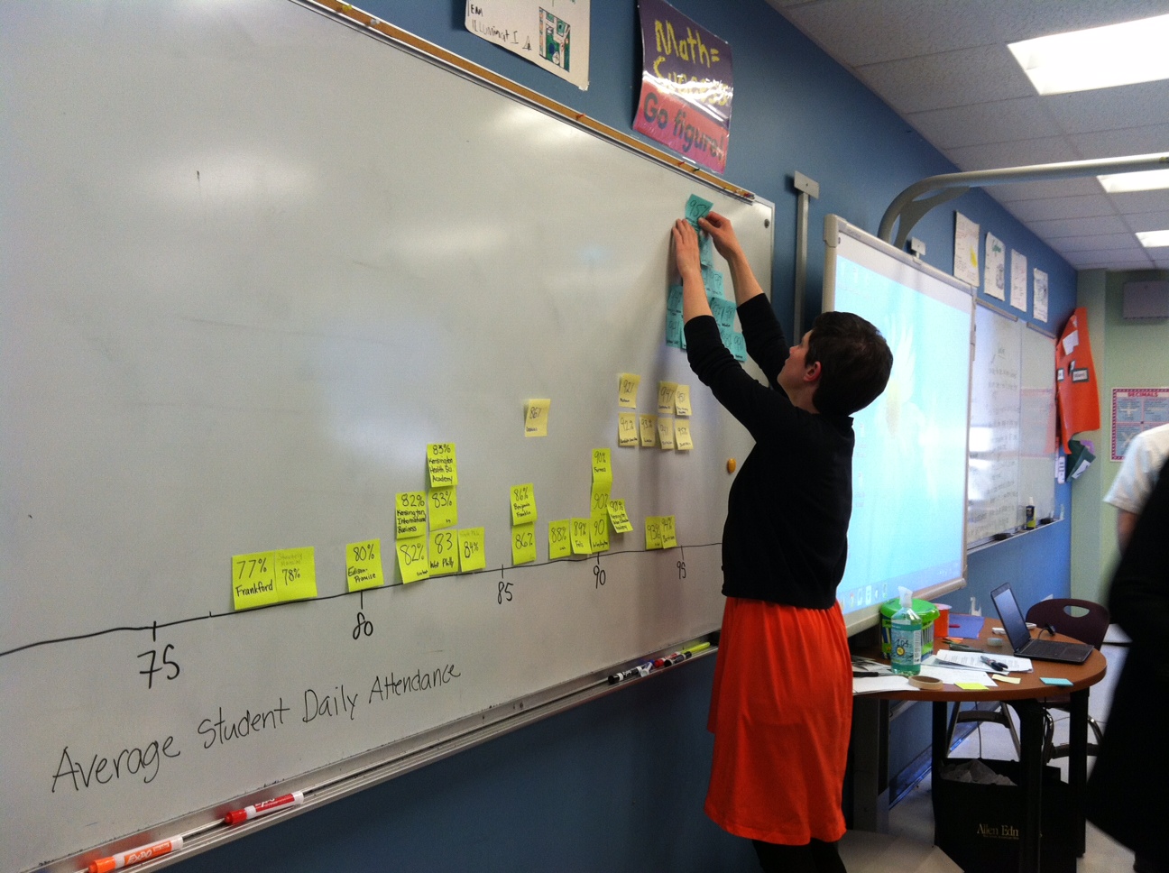
Explain to students that you will be organizing and representing the Citywide school attendance data on a number line plot
- Draw a number line from 70-100 with enough space to place at full sticky note at each integer value.
- Write the name and attendance rate for each citywide school on a different sticky note. Have students call out the numbers as you write them.
- Demonstrate placing the first sticky note at the right number and just above the line. Explain that if two sticky notes have the same number, the second one should go immediately above the first one, but not cover it.
- Give each sticky note to a different student to place on the number line.
Once the line plot is contructed, ask students to make some general observations.
- Talk about the overall shape of the distribution and the spread of data: review terms maximum, minimum, and range
Lead them to discuss the following measures of central tendency by using the plot. If students already know the procedures for finding these measures, acknowlege this, but focus on the meaning of the measures.
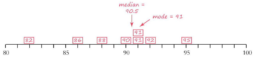
Find the Mode
- Which attendance rate appears most frequently? Review the term mode and tht it means the most common. Discuss that data sets can have several modes or no mode, demonstrating this by moving one sticky note temporarily and then replacing it.
- Discuss what information it gives and what it leaves out. For example, if it just so happened that three schools had attendance rates of 82% and all the rest had attendance rates in the mid-90s but they were different numbers, the mode would not represent the typical school
Find the median.
- Ask students to describe what the median is .
- Have two volunteers come up to the number line on the board and point to the two numbers that are farthest away.
- Coordinate them to walk toward each other, moving forward one data point (sticky note) at a time, until they meet in the middle. Remind students that if two data points have the same value, each one should still be counted.
- Identify the median and ask what does the median tell us? (50% of the data is above that point and 50% below)
- Discuss what information it gives and what it leaves out. For example, it does not tell us much about how close or spread apart the data are.
- Pretend that the school with the lowest attendance rate actually had an average of 60% daily attendance and move the sticky note to 60%. Ask: how does this change the median? Agree that it does not change.
- Ask: Is it helpful or not helpful that the median doesn’t change when one value changes? It is helpful when there are a few outliers, but not helpful when you want a more precise answer that takes more information into account.
Find the mean.
- Ask students to describe what the mean is and how it is calculated. Agree that it can be calculated by finding the sum of the data points and dividing by the number of data points.
- Explain that another way of thinking about the mean is like the center of balance on a see-saw. You are trying to find the point at which both sides are exactly balanced.
- Explain that when you were looking for the median, it didn't matter how close or far away a number was from the median, you were just looking for the number of data points on each side. In the mean, however, the distances from the center are important.
- Have two more student volunteers come up to the number line on the board. Explain that they will be moving the sticky notes closer together until they find the mean in the middle. (Explain that they sticky notes can be put back when they’re done.)
- Have the student on the left move the farthest-left data point in one space (from 82 to 83, for example.) Have the student on the right move the farthest-right data point in one space (from 95 to 94, for example). Repeat this several times. At some point, the data point that was farthest out will move past another data point. Then, the other data point becomes the one that is farthest out.
- Reinforce that each movement on the left needs to be balanced by a movement to the right. So if you need to move 82 inward 8 spaces to get it close to the others, then many data points on the right will need to be moved inward to balance out those 8. See the example below:
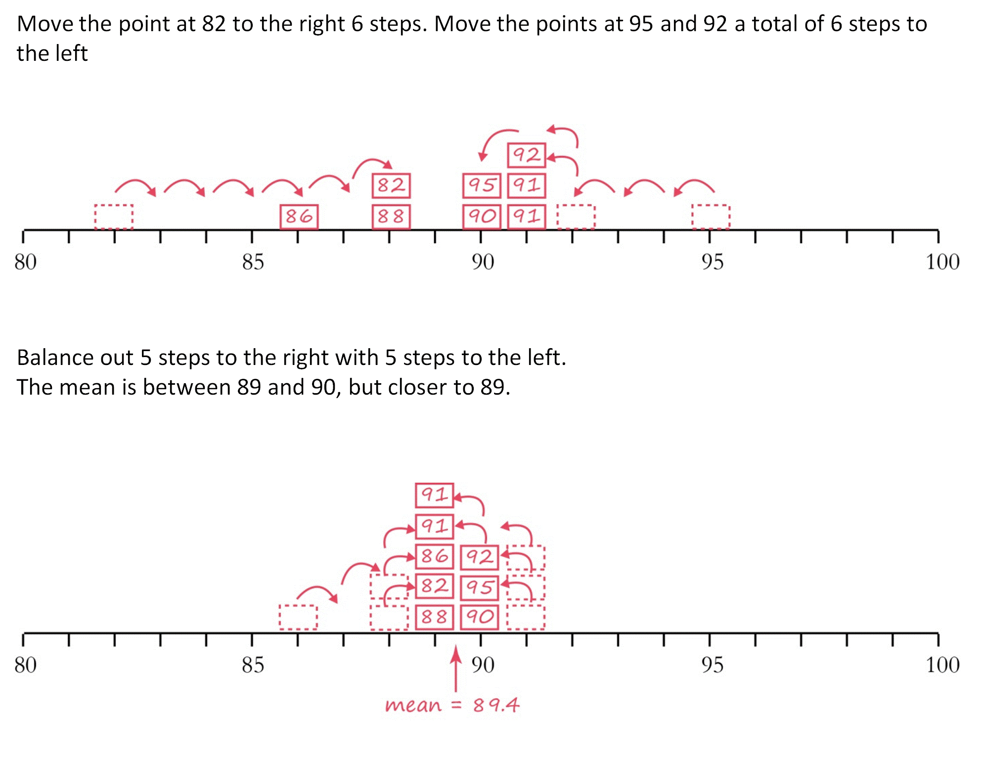
- Continue this process until all of the data points are in two columns, so that moving them inward just results in switching places. Discuss that the center of balance is between those two values, and closer to the one with more numbers. This is the mean.
- Have students calculate the mean using the traditional method of adding the values and dividing by the number of values to check their work.
- Pretend that the school with the lowest attendance rate actually had a rate of 60% and move the sticky note down. Have students explain how this would impact the mean.
- Ask: Is it helpful or not helpful that the mean changes so much when one value changes? (It is helpful if there aren't a lot of outliers and you want more precision. However, one outlier can throw off the mean significantly which can be confusing and not give a good representation of most of the set.)
Discuss whether the mean, median, and mode are close together or far apart for the attendance rates at citywide schools. Students should observe that they are close together, which indicates that the data is spread out in about the same way on both sides of the mean and median. (That the mode is close is just chance.)
Comparing Attendance Rates at Different School Types
Divide the class into three groups and give each group a different color of sticky notes and marker. Assign one group to neighborhood schools, one group to special admissions schools, and one group to charter schools.
Have each group calculate the mean, median, and mode on the board using the strategies modeled. At the end, there should be a single number line with the numbers lined up to show the means of each school type.
Have students record the data for all four school types on student handout and note patterns and numbers that don’t fit the patterns within their groups.
Exploring Other Categories (if time permits)
Have students break into groups of 2 or 3 students and choose another category to study (for example, percentage of low-income students, average SAT reading score, college-going rate). Ideally, one group of students should study each category, but support students in choosing a category that they’re interested in.
Have students calculate the mode, mean, and median for their data on the student handout and note patterns.
The discussion should focus on how measures of central tendency were used to help understand the characteristics of high school types in Philadelphia. Encourage students to articulate the important differences between the median and mean, use data to back up their assertions, and think about who is advantaged and disadvantaged by the school selection process.
- How do the mean, median, or mode help us to understand trends in data?
- When is it best to use the mode? The median? The mean?
- What trends did you see in the attendance data? Why do you think these trends occurred?
- Special admission, citywide, and charter schools can expel (kick out) students who are frequently absent without a reasonable excuse like a doctor’s note. What impact do you think this has on the school overall?
- What impact does this have on the students who is expelled?
- What impact does this have on the neighborhood schools which cannot expel students and must accept students who are expelled from other schools?
- What trends did you see in the category that you studied? Why do you think these trends occurred?
- Is there a relationship between your category and attendance? Why do you think there is (or isn’t) a relationship?
- In the category that you studied, are charter schools more similar to special admissions, citywide, or neighborhood schools? Why do you think that is?
- Have students read more about Philadelphia High Schools at: Fall_Guide_2015.pdf. (A new edition comes out each fall.)
- To find the data available as a Google spreadsheet, go to http://thenotebook.org/articles/2015/09/03/philadelphia-s-district-and-charter-high-schools-how-are-they-doing.
- To find more data on charter schools, see http://webgui.phila.k12.pa.us/offices/c/charter_schools/profiles
- Have students do additional research on the high school admissions process.
- Invite a high school admissions counselor to speak with the class.
- Have students complete Comparing High Schools 2: By the Numbers, in which they look for other trends in the same data using line plots and box plots.


Comments
(no comments)