
 Attendance and Graduation Student Handout
Exploring High School Data 1: Are Attendance Rates Related to Graduation Rates?
Submitted By:

Students examine current data on Philadelphia High schools and consider correlations between variables such as average daily attendance and 4-year graduation rates. They construct a scatter plot, draw a line of best fit, discuss correlation direction and strength, and discuss whether correlation is likely to imply causation and other factors that might impact both variables. Students notice differences between special admissions, citywide, neighborhood, and charter schools and reflect on them as a social justice issue for all students in the city, as well as considering their personal choices for school admissions.
- High school data for the current year for your district.
- Chart paper for recording questions
- Colored markers or pencils
- OPTIONAL: Computer software that can be used to create scatterpolots (such as Excel)
Elicit students’ expertise and generate curiosity about high schools in the area, how high schools are chosen, and questions that students have. Support students in answering each other’s questions if they can, or record questions to answer later rather than trying to answer general questions now.
- What high schools have you heard of? What do you know about them?
- How do middle school students choose which high school to attend?
- What questions do you have about choosing a high school?
Have students share what they know about the four types of Philadelphia high schools: neighborhood, citywide, special admissions, and charter. After students have shared, confirm or correct their ideas using information from Four Types of High Schools.
Have students explore the data from The Notebook's free resource, 2016 Philadelphia High School Data. (Note: An updated report is posted each year.) Invite students to share observations and questions. Give students some time to make sense of the data table and share their thinking before moving on. Explain to students that the school district records information about each school like number of suspensions, test scores, daily attendance, and so on. Ask: Why does the district collect this information? How could using this information help you to pick a high school?
Ask students to generate questions about the data and record their questions on chart paper. If no student asks about whether there is a relationship between graduation rate and attendance rate, ask it yourself and add it to the list.
Discuss how attendance rates and 4-year graduation rates are calculated:
Attendance rates are calculated by finding the percent of enrolled students who come to school each day, and then averaging the values for all of the days of school.
Graduation rates are calculated by tracking individual students who start in a school in 9th grade and recording whether they graduate within 4 years. Students who transfer to another school in the district are still matched to the school where they started 9th grade (but students who transfer to another district are removed from the data set).
Ask students to predict whether they think there is a relationship between attendance and graduation.
- If there is a relationship between them, what would we expect to see in the data?
- Ask students to brainstorm ways that they can compare the attendance rates between school types. This question should provide an informal assessment of students’ background in measures of central tendency and distribution. Students may mention mean, median, mode, line plots, box plots, scatter plots, bar graphs, stem-and-leaf plots, or other options.
Explain to students that you will be using scatter plots today to look at the relationship between the two variables. Using the citywide data (which has a small number of schools), have students support you in making a scatter plot and best fit line on the board.
- Invite students to help you review the steps of making a scatter plot, including identifying the x-axis, y-axis, scale, and key, locating a point between grid lines, etc.
- Ask students to share their observations. At this point, let students describe the trends in their own words.
- Demonstrate or have a student demonstrate how to sketch a line of best fit with roughly the same number of points above and below the trend line. Discuss that a point that is farther away has a greater “pull” in the line than points that are close.
- Discuss what the line represents in terms of the context. Note that the term correlation is introduced in the handout but you could also introduce it now.
Terms: coordinates, best-fit line, scatter plot, relationship, correlation
Explain that each group of students will be creating a scatter plot that includes all of the high schools and that they will also be looking for patterns, constructing trend lines, and thinking about the reasons behind the patterns. There are several options for organizing the exploration:
- Have each group create a scatterplot for each type of high school (neighborhood, citywide, etc.) on the Attendance and Graduation Student Handout, using a different color or mark to identify each school type.
- Have the different groups plot different types of schools on the handout and then share results across school types at the end.
- Have students use computer software to enter the data and create the scatterplots. Project the graphs for the discussion.
As students work, circulate to support them in using what they know to both plot the data and make sense of the results. Once they have plotted the data there are several questions to answer on the handout. Students should:
- Look for overall trends and draw a line of best fit.
- Consider different types of correlation and identify that the data has a weak, positive correlation.
- Brainstorm potential causes for the correlation and think about whether correlation implies causation.
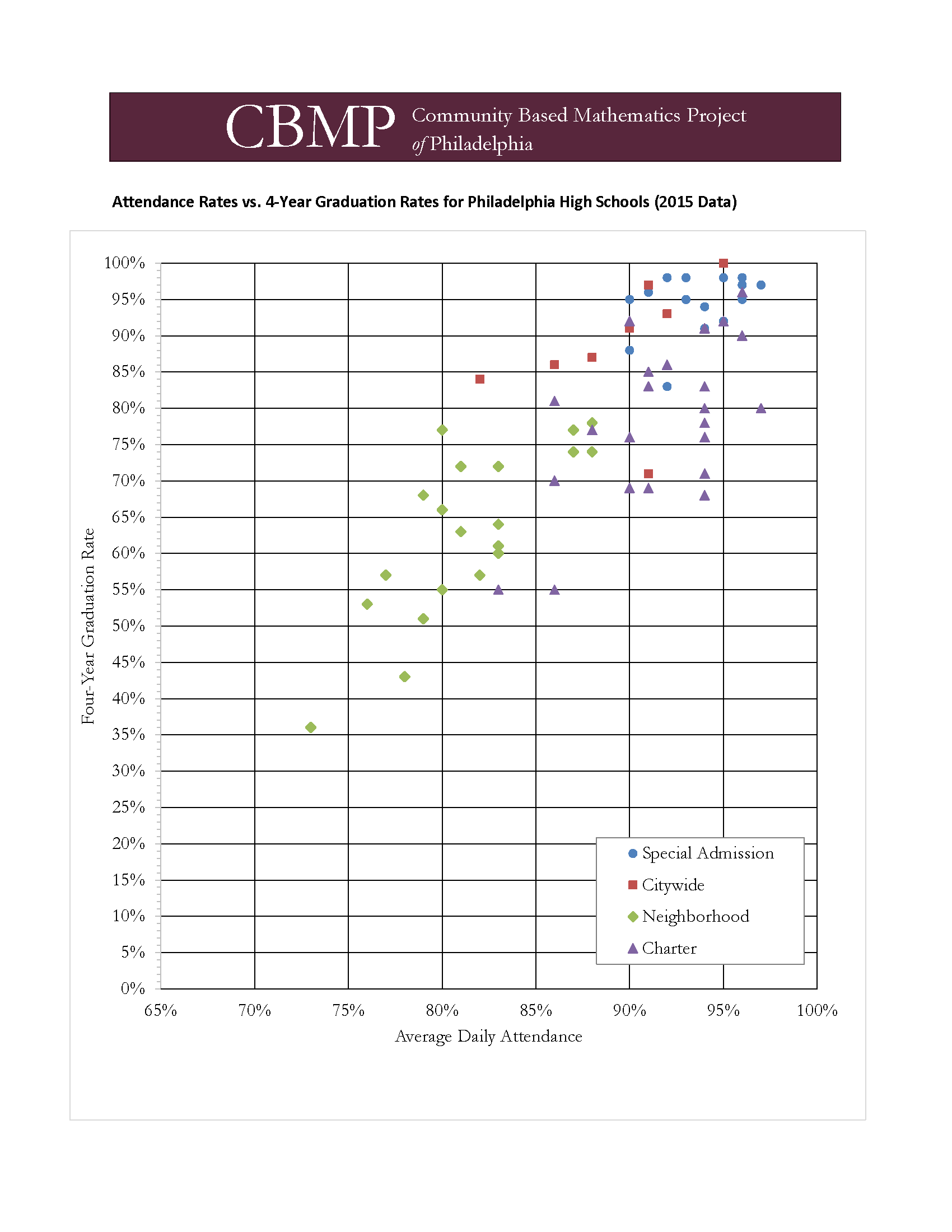
A sample scatterplot from the 2015 data is shown below for your own reference.
Bring students back together to discuss their results and findings. If different groups worked on different data sets, project their work to share with the whole class.
- What trends did you see between average daily attendance and four-year graduation rates? Support students in using mathematical language to describe what they observed.
- Why do you think these trends occurred? This question has many possible answers, including different student bodies that are admitted and different levels of support and opportunities within the schools. Students should recognize that this is a social justice issue--not all schools are equal in terms of their resources or opportunities, and those that have more resources have limited spaces available and require additional steps to enroll.
- Statisticians say, “correlation does not imply causation.” What does this mean? Have students think about the language of the question and what it might mean for their data. Students should come to the conclusion that just attending school by itself does not necessarily result in graduating within four years, and that there are other factors that likely impact both variables.
Discuss what this exploration means for students’ high school admissions process.
- What school types are you interested in attending? What specific schools would you like to attend?
- How did looking at this data change how you think about high school admissions?
- What further questions do you have about high school admissions?
- Have students write the equation for the trend line. Because the scale of the graph is set up so that they y-axis (where x = 0) is not shown, they must find the equation for the line using other means. Students use point-slope form, plug a point into slope-intercept form to solve for the intercept, and use a table to find the intercept.
- Have students read more about applying to Philadelphia High Schools at: http://thenotebook.org/articles/2016/09/15/q-a-about-applying-to-high-schools3
- Research individual schools at http://thenotebook.org/high-schools.
- Have students do additional research on the high school admissions process.
- Invite a high school admissions counselor to speak with the class.
- Exploring High School Data: What's Related?, is a follow up lesson in which students analyze variables of their choice using the same methods.
Comments

Guide to Philadelphia High Schools
The Philadelphia Notebook publishes a new edition of the guide (with updated data) every Fall.


Comments
The Philadelphia Notebook publishes a new edition of the guide (with updated data) every Fall.